Showing posts with label Design and Organize. Show all posts

Wednesday, July 17, 2013

Let the Painting Commence!

Hello everyone! I hope that you are having a great week so far! We just returned from an amazing trip to London, Paris and Bordeaux for one of my dear friend's weddings. The wedding was absolutely BEAUTIFUL and it was so good to spend some time with our Aberdeen friends who we haven't seen for far too long! The renovations continued at the house while we were gone, with tile being installed and the long painting process commencing. So far, the painters have focused primarily on all the wainscoting and trim.  Last week, I showed you the primed and sanded wood work...but now, we have first coat of paint to the wood work as well (the walls and ceiling paint will come next).  It is really cool to see our color pallet finally coming to life!  In the words of Homer Simpson...can I get a "WooHoo"?!?!?! 
 
 
But before we check out the paint, here are the colors that we have picked for the house:
 
 
So now, onto the dining room and the living room. As you can see in the picture above, we are painting the wainscoting and trim a dark brown color called Bronzetone 60 from Benjamin Moore.  Here is a view of the dining room from the living room:
 

I love the rich color of the wainscoting. However, to keep the rooms from turning into black holes, are going to paint the walls a dark cream color by Ralph Lauren called Plaza Blanca.  The color is from their suede collection which will also give a subtle texture to the walls.  Here is another view of the dining room and the painted wainscoting. 


On the stairwell, we are using a custom cream color for the wainscoting. We chose to paint the stairwell cream because the color scheme upstairs is different than the color scheme downstairs...specifically, we are going to have bright white wainscoting and light gray walls upstairs.  So, in order not to have such a drastic change from downstair's cream walls and brown wainscoting to the upstair's gray walls and white wainscoting, we are using the stairwell as a transition area and will have cream wainscoting with the same Ralph Lauren Plaza Blanca color on the walls.  Here is a picture of the stairwell...although the color isn't showing quite right (it is more cream than white). 
 

Here is another picture of the stairwell where you can see the wainscoting a bit better.


And here is the upstairs hallway with all the wainscoting, baseboards and crown molding painted.
 

We are also painting the wainscoting in the reclaimed attic bright white. And in this picture, you can see the hidden doors that open up to major storage in the eaves of the attic.


And here is a picture of another upstairs bedroom. 

 
We previously painted the walls blue (I was going for a Wedgwood look) and are keeping the same color scheme.  However, we are repainting this room because we had to fix the chair rail and baseboard when we relocated the entrance door.   I LOVE the combo of the blue walls and white trim..it is very peaceful and relaxing to me.  So that is all for now.  I hope you enjoyed seeing the painting progress that we are making around the house. Thanks so much for stopping by! 
 

Thursday, May 16, 2013

Replacing the Staircase from "H-E-Double-Hockey-Sticks" with a Heavenly Staircase

Happy Wednesday everyone! We are half-way through the week and I hope that it has been a great one for you so far! Today we are going to check out the progress on the stair case.  Back in December, I told you that one of the big motivating factors for the remodel was to fix the killer staircase that lived in our house. Basically, the staircase was super steep because the stairs were extremely narrow (each step was only about 7 inches long) and extremely steep (each step was a different height). And, unfortunately, when you combined the fact that my closet was upstairs with my weakness for 5 inch heels and my propensity for being late...you ended up with this scene playing out in our house on a weekly basis:
 

And on a complete side note, although I am 5' 9.5" (can't forget that 1/2 inch), I belong to the school of thought that heels make your legs look pretty. To me, the taller the heel the better! This is a view of the death-trap stairs from our dining room before we started the remodel.

 
And here is a close-up of the steep little buggers pre-renovation. Not good I tell ya, not good at all!
 
 
To resolve the steepness factor, we moved the staircase against the front wall of the house, which allowed us to make the staircase much longer and install regulation stairs.  Here is our original floor plan that shows the location of the stairs before the renovation started (they are highlighted in yellow). 
 

And this is our new floor plan that show where the stairs have been relocated.


An added bonus of moving the stairs was that it completely opened the space between the entryway and the living room so that the living room became one large space instead of a decent sized living room and an awkward "foyer".  You can see really see the difference in the space in this picture of the new staircase that was taken from the dining room once the drywall was in.
 

Here is another view of the new staircase after the wood floors were installed.


A couple weeks ago the trim carpenters came out and installed the wooden treads and started on the wainscoting.


This is what the stairs looked like after the treads were installed. So pretty!

 
After the treads were installed, I got to pick out the balusters and newel posts.  This seems like a simple task, but there as so many different options to choose from, it can be a bit overwhelming.  First, you can have metal railings with glass walls like the staircase in Apple's Paris store:


Although I think this is super cool...this look is too modern for our house.  A second option is metal poles and wires. 
Here

Again, a bit too modern for the look that we are going for. Also, since we are planing on adding kiddos to the mix at some point, I am afraid that the wires would scare the living daylights out of me once the little ones became mobile.  A third option are wooden balusters and newel posts, like this beauty:
 

Here

I love everything about this picture.  The dark floors, the dark treads on the stairs, the wainscoting and the large craftsman newel post.  In my book, this is a stunning example of traditional architecture and design.  Although I love this look, another option is metal balusters, like this: 

Here


Again...this baby is 100% drool-worthy to me! What I really love about this look is that it combines traditional furniture, wainscoting and columns with a rustic (yet super glamorous) metal banister.  The only problem here is the price tag that this bad boy comes with.  I don't know for sure how much the banister costs, but I can pretty much assure you just by looking at it that it is well beyond our budget.  So that leaves us with the least expensive option around...


Just saying "for-get-about-it!" to the newel post and balusters all together and opting for a floating staircase! How amazingly cool is that?!?!  But, going back to the child fear factor issue (and my own safety considering I have issues walking down stairs in 5" heels), these guys aren't going to cut it either.  So, Matt and I ultimately decided that we loved the mixture of traditional wainscoting with rustic metal balusters.  However, in order to keep the pretty factor that metal banister above has, I decided to start with this swirly beauty as my base:   


I then went online and found a website with a "design-your-own-staircase" application and created this layout for our staircase...which is a mixture of the double "S" balusters, single twist balusters and double twist balusters (because I thought that all "S" balusters would be too much and by spreading them apart, it makes the "S's" really pop).


I will report back tomorrow with the finished product! What about you guys, what type of staircase would you like in your home?  Thanks so much for stopping by and have a fantastic Thursday!


Monday, May 13, 2013

Vintage Bathroom Remodel - Part Two

 
Happy Monday everyone! I hope that you all had a wonderful Mother's Day weekend and were able to enjoy a lot of QT with your mama's and babies!  Matt and had a great weekend and had fun on our "Tour O Mom's" yesterday.  It was wonderful to spend time with everyone...and in honor of Mother's Day, here is one of my all time favorite pictures of my Mama and me from our last pilgrimage to the mother land - AKA Disney World - enjoying hot cocoa and cookies at Mickey's Very Merry Christmas Party.
 
 
We are both HUGE Disney nuts and this picture pretty much sums us up perfectly when we are there...100% kids 100% of the time.  I mean, what's better than sporting your ears, stepping back into childhood and leaving the real world behind at the Happiest Place On Earth?  Not too much in my book!
 
 
After looking at these pics, I am geared up for another trip to Disney World!  It doesn't take much I tell ya! So now, let's venture from the Happy Place on Earth, to "Jennifer's-Soon-To-Be-Happiest-Place-On-Earth-At-Some-Point-In-The-Near-Future-Please-Dear-Lord".  Today we are heading back upstairs to the Guest Bathroom.  So much progress has been happening over the past few weeks, it's amazing!  I get super giddy just thinking about it!  Last week I showed you where the Guest Bathroom started before the remodel kicked off and the beginning of demoing the old gal.  And here is what she looked liked once demo was complete, all the 1960's wall paper, tile and drywall was removed and she was down to her bare bones.   
 
 
Don't worry, she's not modest! Once we got her down to the studs, we repositioned a few walls to create the new and improved Guest Bathroom with a Shower Room and a Vanity/Storage Room, which you can see highlighted in yellow in the blueprint below.
 
 
Here is the Vanity/Storage Room after the plumbing was relocated, the new window installed, the dry wall was up and fully taped and floated.
 

In this room, we are going for a retro 1920's feel with white subway tiles, basket weave carrara marble floors, medicine cabinets, dark vanities and hotel style linens.  Here is my inspiration board for the room.
 
 
The first things that have arrived are the vanity and linen cabinets.  My plan was to install a double vanity against the outside wall under the window so that two people could get ready simultaneously and there would be plenty of natural light in the space.  However, my goal was to make it look like an old piece of furniture that had been converted into a vanity, like the Restoration Hardware vanity above on my inspiration board...however, without the Restoration Hardware price.  Here is the design drawing that I put together for the cabinet makers.


The vanity is two 36" sink bases connected with three 12" wide drawers in-between.  I chose this layout because I think it will provide lots of storage space under the sinks, along with drawers for items like tooth brushes, hair brush and hair dryers, etc.  And here is the vanity after it was installed (minus the feet and counter tops).


We picked dark java cabinets for the vanity...but unlike the Master Bathroom cabinets which are Rustic Cherry, these cabinets have a classic smooth finish.  We felt that this would help contribute to the retro feel that we are trying to create.  We also chose the java stain instead of black paint because we wanted to see the pretty grain in the wood.  Also, although the vanity will provide lots of storage, I wanted to add additional storage in the room for linens and other bathroom necessities (because one of my big goals with this remodel is to become organized, and for me to be organized, I need lots of storage so that there can be a place for everything and everything can be in it's place).  To create the additional storage, I decided to put two large floor to ceiling linen cabinets on the wall opposite of the vanity.  Here is my design for the vanity cabinets:
 

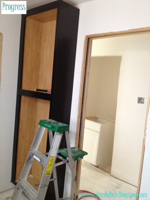
Because the bathroom is somewhat narrow (it's 8 feet deep), I needed to conserve space with the linen cabinets so that the room didn't feel cramped once they were installed (especially since the linen cabinets are also stained java).  To make this happen, the linen cabinets are only 12" deep.  However, as you can see in the picture below, 12" is plenty of space and will provide lots of storage - WOOHOO!

 
 And here is her twin on the opposite side of the door.  They still need their doors and crown molding, but this at least this lets you see how the cabinets will fit in the space.


I am telling you, these bad boys are going to send me to storage heaven! I absolutely cannot wait until I get to start filling them up the linens for the upstairs bedrooms and all sorts of fun bathroom goodies for our guests.  One things for sure, I will be spending lots of time over at I Heart Organizing to get plenty of ideas and inspiration on how I can organize this space and make it pretty! So here's to visions of loverly baskets and Martha Stewart Labels dancing in my head!!!  So how about y'all...do you have any good bathroom organization ideas or tips that you can share with me, because I need all the help I can get and would love to hear them!  Thanks you so much for stopping by and I hope that you have a wonderful week!!!


LinkWithin

Related Posts Plugin for WordPress, Blogger...