Tuesday, December 18, 2012

A'door'ing Doors!

The next item on our massive "To Do" list is to pick out a front door, which meant lots of evenings checking out Houzz, Pinterest and Decorpad for inspiration.  While combing through the interweb, I have found myself drawn to red and black doors.  I have always heard that a red door means "welcome", but had no idea what a black door meant.  The words that pop into my head when looking at black doors are things like "sophistication", "style", and "sleek".  So after some research, I discovered that, according to Feng Shui, the front door is the "the mouth of Chi" for your home and if its color is chosen properly, can attract energy for your home to nourish and sustain good health, happy relationships and professional success. Ummmmm yeah, so that just ratcheted up the pressure factor to make sure we pick the correct door for our home! Sheesh!!!  So today I thought it would be fun to check out what the color of your front door says about you and some of my favorite inspiration doors. 
 
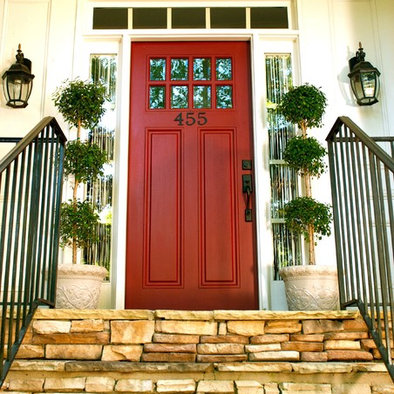
We'll start off with my first love affair in front doors...the classic red door. Red doors mean "welcome" and in Feng Shui symbolize prosperity and wealth.  Apparently, during the times of the Underground railroad, a red door was the sign of a safe house.  Also, people with red front doors are apparently extroverts and take a more relaxed approach to life.  Here are some red doors that I have been a'door'ing the past few weeks. First off, I L-O-V-E the deep red tone of the doors below and their massive black strappings! To me these doors provide a bold statement, but maintain a welcoming appearance. I am also loving the shape and details of the window above the doors.
 
Here

Turning a complete 180 from the ornate doors above, I found this little beauty. I love the classic charm of this door and the balance that the paneling, the windows and the side lights provide. I also like how the white trim and black accents highlight the door and make it take center stage in this entryway.

Here
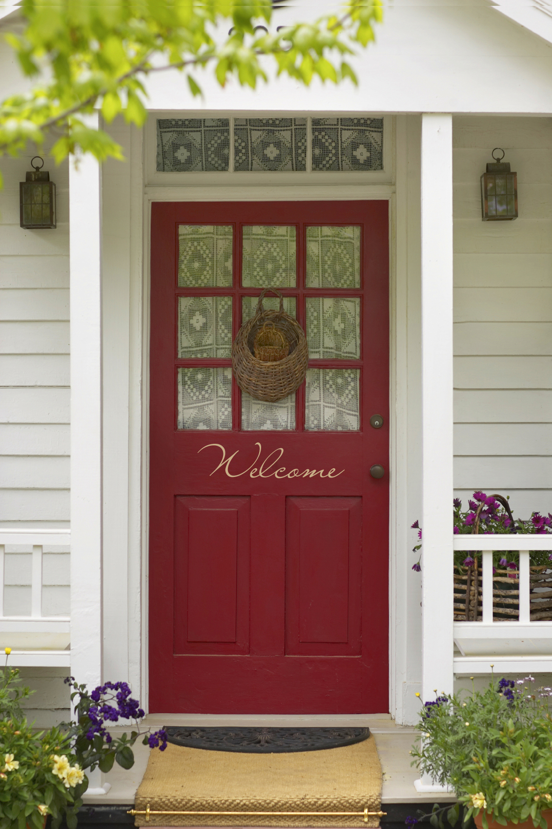
And what can be more inviting than a red door with "Welcome" scrolled across the front? This entryway is adorable and I love the charm and contrast that the quilted curtain provide.
Here

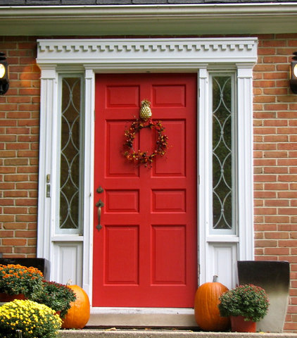
I also came across this sophisticated little devil.  I am dig'n the dental molding along the top of the door frame and the detail in the sidelights. The white trim also makes the red pop against the somewhat orange'ish brick.
Here


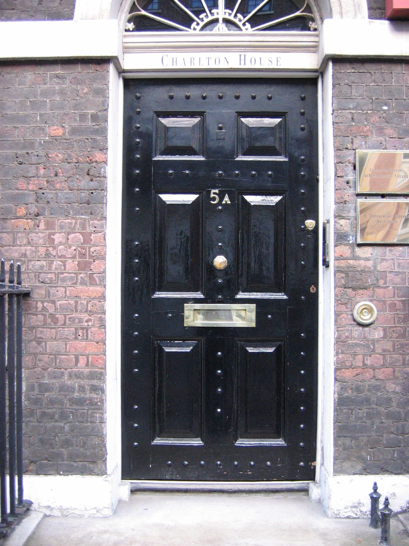
Now onto my latest love...the black front door.  At first, I thought that a black front door would be unwelcoming and dreary.  However, after searching the web, I have found that black doors add sophistication and style.  According to Feng Shui, black front doors provide elegance and calmness and create protective, solid energy that acts like a powerful shield. Also, studies have shown that black front door owners are the most successful in their careers.  Sounds good to me!  Below is my favorite black inspiration door. I love the crisp and classic lines of the door's raised paneling and the unexpected detail of that the large nail heads provide. I also like the contrast of the gold accents on their black canvas.

Here

I think that these black doors are absolutely fabulous.  I completely dig the contrast of the sharp square angles of the door against the soft curves of the paneling, the handles and the sunburst window.  And while I'm at it, the ivy trellis is pretty fabulous as well!
Here


The next color that caught my eye was yellow. It is a complete switch from black, but there is something inviting about a bright and cheery yellow door!  According to some Feng Shui experts, yellow evokes mental clarity, perception, understanding, wisdom, confidence, curiosity, humor and merriment.  However, other claim that homeowners with yellow front doors are the loudest and most likely to admit that they are bad neighbors...but hey, that is pretty consistent with a home full of humor and merriment!  I love everything about the door below...the intricacy of the panels, the gold accents, the detail and shape of the window above and the boldness of the concrete surround. Also, the bright yellow just makes me happy!
 

Here
Next, we move onto blue. According to Feng Shui, blue equals water, which equates to calmness and is linked with feelings of security and stability. Some folks also believe that blue suggests a feeling of abundance and prosperity. This door is very similar to the doors above with the detailed paneling, the large nail heads, gold accents and sunburst window. Although the blue door against the white trim is bold, it is very calming to me.  I guess the Feng Shui experts know what they are talking about!

Here
Homeowners with green doors are supposed to be the most trustworthy. Many cultures also believe that green represent balance, peace, compassion, growth, renewal, and harmony.  I love how the green door below pops against the white house and the bold surround.  I also like the the cheeriness and playful feeling that the yellow accents provide.


Here

Next let's look at purple.  Homeowners with purple doors are said to be the most sociable and the most likely to have a group of very close friends.  Purple also symbolizes energy and is thought to invite opportunities into your home. In Feng Shui, purple is very versatile because it is the only color that you can place in any direction...so some people believe that a purple front door means that the homeowners are versatile and open-minded.

Here
And finally, pink!  Homeowners with pink front doors are said to be daring, and who also have the most friends and are full of mischief.  Pink reminds me of happiness and smiles. I love the pop of color the pink door above and below provide their homes...however, I am pretty sure that Matt will veto me if I come home with a gallon of pink paint for my front door. So sad!


So after going through all these doors and their meaning...I think that I am leaning towards black or red. Decisions decisions decisions!  I'd love to hear what your favorite front door color is.  I hope you have a wonderful day and enjoy the next several days leading up to the holidays!
post signature

Saturday, December 15, 2012

Praying for the Newtown Families

Yesterday's tragedy in Newtown, Connecticut is horrifying. I do not have children of my own, but have nieces and nephews whom I adore and cherish as well as countless friends with their own precious children. I cannot being to fathom the pain and grief of the family and friends of those effected by yesterday's tragic events. My heart and prayers are with you.


post signature

Wednesday, December 12, 2012

Stairway To Heaven

One of the changes we are making to the house that is having the biggest impact is relocating the staircase. We are making this change for several reasons. First, as I previously mentioned, our old stairs were EXTREMELY steep. The picture below illustrates the rise and run on standard staircases.


As you can see from the picture, a typical Rise is 7 ¾" and a typical Run is 10 ½". Our stairs, however, had Rises varying between 8" and 9" and Runs varying between 7" and 8". That might not seem like that big of a difference, but the loss of 2" to 3" on the Run is HUGE because your feet don't fit on the stairs, which has caused a lot of Boy George moments for me, Matt and our guests (sing it with me…"I tumble for you, I tumble for you!"). The second reason for the change is the fact that we are closing off the pass-through on the back of the stairs because we are turning the old study into our master closet. The floor plan below shows the old stairs outlined in red and where we are closing off the pass-through for the new closet, which is highlighted in blue.


And here is a picture that shows a view of the old stairs from the dining room.


Closing off the pass-through on the back of the stairs, however, meant that we would have to remove the banister any time we wanted to move furniture upstairs because there would not be enough room to "PIVOT" any furniture around the 90 degree turn on the stairs. When you read "PIVOT" you have to imagine my all-time favorite Ross moment on Friends when Ross, Chandler and Rachel are trying to move Ross's sofa up the stairs…that, ladies and gentlemen, would be our exact problem here.


So, after staring at the stairs for about two years to figure out how to resolve this issue, I finally had a Lightbulb! moment and decided to move the stairs out towards the front door. Here is my original sketch that I came up with back in May.


And here is my pitiful Photoshop'ed picture that shows how the stairs will work in real life.


I know I don't have mad drawing skills, but when an idea strikes, I have to get it on paper ASAP or I will forget it. However, as you can see in the picture and the floor plan, we have to move the front of the house out 5 feet in order have space between the front door and the stairs. But this was more than okay with me, because that meant that our dining room would also be 5 feet longer. Win-win I would say. The absolute best part of moving the stairs, though, is the fact that we now have room for a laundry room upstairs and are able to put a large built-in desk in the new landing to create an open study area. Here you can see the old floor plan with the stairs highlighted in red.


And here is my original sketch of the second floor with the stairs moved.


The final benefit of moving the stairs, was that it allows us to completely open the living room and remove the wall that used to divide the living room from the old foyer. The first picture shows the living room looking from the back yard before the stairs were moved, the second picture shows the living room looking from the backyard after the stairs were moved, and the third picture shows a close-up of the new stairs and where the old stairs used to be (and the wall in the middle of the picture is a temporary wall that will be removed once the second floor is properly supported).


This really opens the living room and makes the space feel so much larger. Here are pictures after the demo upstairs.


And the best part of all…my feet fit‼!


Ahhhh, the little things in life make such the difference! Thanks for stopping by. I hope you have a great day!

post signature

Monday, December 10, 2012

Taking It Back To The Old School…

A couple of weeks ago, I showed y'all the vintage design that Matt and I are trying to emulate in our guest bathroom (here).

We have run into a bit of a road block, however, because we love the black-and-white color scheme you see in a lot of vintage baths, but are concerned that it will be too harsh in our small space. So after scouring Pinterest, Houzz and Decorpad, I found an alternative option that I love, but am afraid that it strays too far from "vintage" theme to a more glamorous feel. The first pic below is our original inspiration and the second pic is my alternative.


I don't know about y'all, but when I hit a road block in trying to design a space, I like to go to the stores to see all my options in person. It is so much easier for me to make decisions once I have a chance hold the hot little gadgets in my hands and see what they look like "for real" (yo). So I hit Ferguson's, Morrison's, the Depot and Lowes and found all kinds of great inspiration. First, I found two contenders for our faucets.


I love the goose neck design on both faucets and the cross handles. Both faucets are extremely similar, but I am leaning more towards the first faucet because I like the thickness of the handle bases. But I love the "Hot" and "Cold" labels on the second faucet's handles, which scream retro to me.


After finding two faucet options, I checked out the shower systems. The first guy that caught my eye was this beauty:


I absolutely adore the exposed pipes, the mix of the cross-handle and lever, the extended gooseneck and the large showerhead. I also love the oil rubbed bronze color; however, we will use polished chrome in the guest bath. The only problems with this shower system are the fact that it did not come with a matching tub faucet (although I am sure the company has coordinating pieces in the collection) and that it was a budget breaker. So, I kept searching and the next possible contender I found is this little gem:


It has a similar goose-neck and large showerhead, but does not have the exposed pipe (which helps with my budget concerns). I also love the tub faucet and the "Hot" and "Cold" labels on the shower valve. So after about 5 hours of retail therapy, I felt like I had a better handle on our "vintage" vision. But before I left the last store, I had to snap this guy:


Cause how freaking cool would it be to have a dragon in our bathroom! I figure that if I can't get this room sorted, we will ditch the "vintage" theme and design the bath around this bad boy. Options people, you always have to have options. Once I got home, and was armed with my original design photos and my new shopping inspiration, I hit Olioboard to create my "Vintage Bathroom" inspiration board. I ended up blending the two bathrooms together and think that this board is a good mix of vintage and glam.

Vintage Guest Bathroom Olioboard

The plan (for the moment) is to keep the black and white basketweave floor tiles and subway tile wainscoting, but soften the room with light gray walls, blue accents and white trim. We will also pick-up the vintage feel with the sink and shower faucets and the memoirs toilet. I am pretty happy with how the blended look is shaping up (meastro, que happy dance music please). But I would love to hear what you think, so please feel free to post a comment! Thanks for stopping by and have a wonderful day!

post signature

Friday, December 7, 2012

I'll Take Any Extra Space I Can Get

Yesterday, we explored our backyard and new patio. So today, we are going to check out the new fourth bedroom that Matt and I are adding above the master bedroom. This is the second of two extensions that we are adding to the house (the first being the 5 foot extension of the front exterior wall and enlarged dormer that we talked about here). We originally thought we would put decking down in the space above the master bedroom and use it as storage. However, the longer we lived in the house, the more we realized that the space was actually begging to be turned into a bedroom. Although the three bedrooms the house has now are large, we ultimately decided to add the 4th bedroom because of the flexibility that it will provide once bambinos enter the picture. So, like we have in previous posts, here is the current floor plan on the left and the new floor plan with the 4th bedroom highlighted in red.


The picture on the left is our "Before" picture with arrows showing the master bedroom and the kitchen. The picture on the right shows where we are today with the new bedroom framed out. I love the size of the room and how it gives some more privacy in the backyard.


Here is what the room looks like from the inside of the house. I think the large window will add a lot of light to the room, which will be needed once we get the roof.


We are also removing the windows in the living room and replacing them with folding doors. The idea is to be able to open the doors to create an indoor/outdoor living space between the living room and patio. Here are the windows that we are changing and an example of the doors that we are adding (I found this picture here). I think they are so cool..they make me do the happy dance just thinking about them‼!


So here we are today. The picture on the left shows the view into the house from the patio. As you can see, not only did we remove the windows, but we removed the wall to the right of the windows to fully open the space. The picture on the right shows the view from the living room. I think the large windows in the door will bring a ton of natural light into the living room and will make the space feel a larger regardless of whether the doors are opened or closed.


Hope you enjoyed the update and have a great day! Thanks for stopping by!!!

post signature

LinkWithin

Related Posts Plugin for WordPress, Blogger...