Showing posts with label House. Show all posts

Thursday, August 1, 2013

What Goes Up (My Walker Zanger Tiles)...Sometimes Must Come Down

Happy Thursday everyone! The weekend is almost here, so time to get ready for some fun! We are going to watch Bob Schneider tonight (he's one of our all time favorites!) and we have some birthday gatherings to attend this weekend...so it should be a busy, but fun one for us. I wanted to pop in real quick before the shenanigans start and give you an update on the master bathroom. As I mentioned in back in April, renovations do not always go as planned, and sometimes you can hit a bump in the road. So far our biggest bump was the H-U-G-E error that the builders, engineer and inspector made with the structural support for our house that could have caused the whole thing to come crashing down if any wind picked up...Eeek!!! Although that was more of a Mount Everest sized bump, we have had lots of other smaller bumps throughout this year-long renovation (some mountains and some mole hills). But we have somehow managed to either fix them or come up with work-around solutions...so my advise when doing a renovation, always try to stay nimble and look at those bumps as fun challenges to overcome instead of disasters that can ruin your day.  Our latest bump was the feature wall of Walker Zanger tile in our master bathroom shower. We were super excited to see it once it was installed, but when we got to the house, we realized the final product was not what we had envisioned.  Here's a picture of what it looked like installed with some notes highlighting the issues:
 
 
The first issue was that the area with the Walker Zanger Ashbury Tiles were too small (we'll call them the "Walker Zanger squares")...I love this tile, so wanted to have as much of it as possible on that wall.  Second, the field tile (which is the travertine tile) was not centered on the Walker Zanger squares.  I am totally "Type A" and saw this as soon as we walked in the room.  Although it might not seem like that big of a deal to some people, I knew this would drive me absolutely batty every time I saw it.  And the third issue is that the space between the two Walker Zanger squares is too wide. Although the Walker Zanger squares are centered above and below and the chair rail, this made the bottom Walker Zanger square feel too low and stubby.  But the good news of this pic is that our tub has arrived!  It hasn't been installed, so isn't in the correct location, but I am in L-O-V-E with this cast iron beauty! I don't know about you, but I think that claw foot tubs are super sexy, MEOW (see there is a silver lining to every storm cloud)!!!  But I digress, so here is a basic sketch of how we plan to fix the tile issue:
 
 
1. Widen the Walker Zanger squares by 2.5 tiles on each side
2. Make the top Walker Zanger square go all the way to the top tile
3. Make the space between the two sets of Walker Zanger squares smaller
4. Center the field tile (i.e., the travertine tile above and below the Walker Zanger squares)
 
So here we are today at the beginning of the "fixing stage" with the border tiles removed. Breaks my heart!!!
 
 
Oh well! The quicker we rip this band-aide off, the quicker we will be one step closer to finishing this project. Good times!!! So that's all for now. Thanks for stopping by and have a wonderful Thursday!!!


Monday, July 22, 2013

Vintage Bathroom Remodel - Part 3


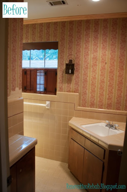
Happy Monday everyone! I hope that you had a wonderful and relaxing weekend. Things were busy here in Houston, but very productive at the house. As I mentioned last week, not only is painting in in full swing at the casa, but the tile in the upstairs guest bathroom is finally being installed and I am super excited to show you how it is turning out! Back in May, I introduced you to our oh-so-loverly guest bathroom and gave you the low down on my plans to give our tiny little "Ode-to-1960's-Wallpaper-and-Tile" guest bath a cool vintage makeover and bring her into the 21st century via the 1920's.  I also showed you the newly installed cabinets in my Vintage Bathroom Remodel - Part 2 post here. But, just to jog your memory, here is the layout of the original bathroom below highlighted in yellow:
 

As you can see, it was a small three piece bath with a single sink, a toilet and a five foot tub.  And here are some shots of the bathroom in all her 1960's wallpaper and tile glory:
 

The first picture shows the view into the bathroom from the hallway.  And this next picture is a view of the toilet and tub (with my back towards the vanity):
 

Although the bathroom had a fun 1960's vintage feel...it was the wrong era for my vision and just too small.  In order to allow two people to get ready in the bathroom at the same time, we decided to expand the bathroom so that we would have a vanity room and a separate shower room. The floor plan below shows the new bathroom highlighted in yellow (with a pocket door that can separate the shower room from the vanity room).
 

After resolving the space and layout issue, my next task was to create a mood board so that I could see how all the different design elements worked together. This is my original mood board that I created for our "vintage guest bathroom (circa 1920) with a hint of modern flare":
 
 
One of the major design elements that I wanted to incorporate into the vanity room was a "tile floor mat" using a combination of basket weave carrara marble tiles and 12"x12" carrara marble tiles.  The "tile floor mat" in this picture was my original inspiration for the space:
 
 
However, in order to work for our guest bathroom, I had to modify the design of the "tile floor mat" from a rectangle to a large "T" shape. This drawing shows the placement of the vanity and linen cabinets as well as the layout of the "tile floor mat" in the vanity section of the guest bathroom:
 
 
And here is how the floor looks installed:


I am so excited how it turned out and absolutely LOVE, LOVE, LOVE it!!! It is exactly what I envisioned and feels so crisp and clean! Here is another view where you can see how the floor works with the vanity, linen cabinet and wainscoting:
 
 
Happy days, happy days, happy days!!! The shower room section of the guest bathroom was too small for a similar floor mat; so we decided to carry the 12"x12" carrara marble tiles throughout that space. You can see the shower room highlighted in yellow below:
 

To keep with the vintage feel in the shower room, I chose white subway tiles for the shower surround.  However, with the white carrara marble floors and white subway tiles, I was afraid that the space might end-up looking a bit too institutional with all the square lines. So, to break things up, I added a herringbone feature to the back wall of the shower surround, which is illustrated in the drawing below:

 
I also made sure that the herringbone feature was centered on the pocket door between the vanity room and the shower room so that our guests would see it regardless of which part of the bathroom they were in.  This is what she looks like installed (and please note that the herringbone feature is centered on the door, I was just standing at the wrong angle when I took the picture):
 

Again, I am LOVE with how it turned out!!! The white subway tiles are so bright and cheery and the herringbone feature adds just enough interest and spice keep the space from being boring! Here is a close-up of the herringbone feature.  J'adore!!!
 

I am so giddy-like-a-school-girl with how everything is coming together!!! It totally makes all the heart-ache and stress of this year-long remodel fade into the background when I get to see my visions come to life!  Here's to hoping that I am going to be as in love with the rest of the remodel as things continue to progress!!! I hope that you are enjoying the progress and updates as much as I am. But before we go, let's have one more look at the the before and after (well, progress) pictures!


SO much better!!! Thank you so much for stopping by and have a wonderful week!
 
UPDATE: CLICK HERE TO SEE AN THE FINAL BATHROOM!


Wednesday, July 17, 2013

Let the Painting Commence!

Hello everyone! I hope that you are having a great week so far! We just returned from an amazing trip to London, Paris and Bordeaux for one of my dear friend's weddings. The wedding was absolutely BEAUTIFUL and it was so good to spend some time with our Aberdeen friends who we haven't seen for far too long! The renovations continued at the house while we were gone, with tile being installed and the long painting process commencing. So far, the painters have focused primarily on all the wainscoting and trim.  Last week, I showed you the primed and sanded wood work...but now, we have first coat of paint to the wood work as well (the walls and ceiling paint will come next).  It is really cool to see our color pallet finally coming to life!  In the words of Homer Simpson...can I get a "WooHoo"?!?!?! 
 
 
But before we check out the paint, here are the colors that we have picked for the house:
 
 
So now, onto the dining room and the living room. As you can see in the picture above, we are painting the wainscoting and trim a dark brown color called Bronzetone 60 from Benjamin Moore.  Here is a view of the dining room from the living room:
 

I love the rich color of the wainscoting. However, to keep the rooms from turning into black holes, are going to paint the walls a dark cream color by Ralph Lauren called Plaza Blanca.  The color is from their suede collection which will also give a subtle texture to the walls.  Here is another view of the dining room and the painted wainscoting. 


On the stairwell, we are using a custom cream color for the wainscoting. We chose to paint the stairwell cream because the color scheme upstairs is different than the color scheme downstairs...specifically, we are going to have bright white wainscoting and light gray walls upstairs.  So, in order not to have such a drastic change from downstair's cream walls and brown wainscoting to the upstair's gray walls and white wainscoting, we are using the stairwell as a transition area and will have cream wainscoting with the same Ralph Lauren Plaza Blanca color on the walls.  Here is a picture of the stairwell...although the color isn't showing quite right (it is more cream than white). 
 

Here is another picture of the stairwell where you can see the wainscoting a bit better.


And here is the upstairs hallway with all the wainscoting, baseboards and crown molding painted.
 

We are also painting the wainscoting in the reclaimed attic bright white. And in this picture, you can see the hidden doors that open up to major storage in the eaves of the attic.


And here is a picture of another upstairs bedroom. 

 
We previously painted the walls blue (I was going for a Wedgwood look) and are keeping the same color scheme.  However, we are repainting this room because we had to fix the chair rail and baseboard when we relocated the entrance door.   I LOVE the combo of the blue walls and white trim..it is very peaceful and relaxing to me.  So that is all for now.  I hope you enjoyed seeing the painting progress that we are making around the house. Thanks so much for stopping by! 
 

Friday, May 17, 2013

Replacing the Staircase from "H-E-Double-Hockey-Sticks" with a Heavenly Staircase (Part 2)

Happy Friday world! Another week has flown by; are you guys ready for the weekend?  I sure am!  My weekend is going to be super busy and filled with running all sorts of errands for the house.  I have to pick out door knobs, cabinet pulls, stone for the fire place and light fixtures...but that means I get to go shopping, so needless to say, I am thrilled! Woohoo! Yesterday I brought you up to speed on the staircase remodel.  As I mentioned, here is what the death-trap, break-your-neck-and-your-shoes staircase looked like before the remodel began.


And here is what the new staircase looked like once it was relocated and elongated.


As I mentioned yesterday, after wading through all the options (glass, metal, wood, wire, none), I decided to use metal balusters with wooden newel posts.  I chose the metal balusters because I like the fact that they bring a bit of a rustic feel to our otherwise traditional living room (we have wainscoting all over the place, including the stairwell) and are somewhat masculine for my husband.  However, just because the stairs would be a bit rustic and masculine, I still wanted to infuse some glam and pretty for me.  So chose I chose a mixture of the large double-S balusters, double twist balusters and single twist balusters, and came up with this design:
Soooooo, after the wainscoting was complete and the balusters and newel posts were installed, we ended up with this as our finished product:


AND I L-O-V-E IT!!!! I am so excited with how our new staircase turned out! The wainscoting and large wooden newel posts satisfy my traditional side, while the metal balusters make the rustic-glam loving gal in me giddy like a school girl. I was busting out some hardcore Carlton, Roger Rabbit, Running Man and every other happy dance you can possibly imagine when I finally saw the finished product!  Progress and pretty...happy days oh happy days! Here is the view looking up the staircase towards the second story landing.


And here is what the staircase and banister look like from the second story. 
 

I love the fact that the double-S balusters are feminine and sexy.  I can't wait to see what everything looks like once it is painted...although we still have to figure out what colors everything will be.

 
So the progress keeps coming slowly, slowy, slowy.  Now onto the next projects, which are granite and tile installation. I will update you on that fun stuff next week! Wish me luck with my shopping extravaganza this weekend. And I hope that you have a wonderful weekend too!  Thanks for stopping by!!!


Thursday, May 16, 2013

Replacing the Staircase from "H-E-Double-Hockey-Sticks" with a Heavenly Staircase

Happy Wednesday everyone! We are half-way through the week and I hope that it has been a great one for you so far! Today we are going to check out the progress on the stair case.  Back in December, I told you that one of the big motivating factors for the remodel was to fix the killer staircase that lived in our house. Basically, the staircase was super steep because the stairs were extremely narrow (each step was only about 7 inches long) and extremely steep (each step was a different height). And, unfortunately, when you combined the fact that my closet was upstairs with my weakness for 5 inch heels and my propensity for being late...you ended up with this scene playing out in our house on a weekly basis:
 

And on a complete side note, although I am 5' 9.5" (can't forget that 1/2 inch), I belong to the school of thought that heels make your legs look pretty. To me, the taller the heel the better! This is a view of the death-trap stairs from our dining room before we started the remodel.

 
And here is a close-up of the steep little buggers pre-renovation. Not good I tell ya, not good at all!
 
 
To resolve the steepness factor, we moved the staircase against the front wall of the house, which allowed us to make the staircase much longer and install regulation stairs.  Here is our original floor plan that shows the location of the stairs before the renovation started (they are highlighted in yellow). 
 

And this is our new floor plan that show where the stairs have been relocated.


An added bonus of moving the stairs was that it completely opened the space between the entryway and the living room so that the living room became one large space instead of a decent sized living room and an awkward "foyer".  You can see really see the difference in the space in this picture of the new staircase that was taken from the dining room once the drywall was in.
 

Here is another view of the new staircase after the wood floors were installed.


A couple weeks ago the trim carpenters came out and installed the wooden treads and started on the wainscoting.


This is what the stairs looked like after the treads were installed. So pretty!

 
After the treads were installed, I got to pick out the balusters and newel posts.  This seems like a simple task, but there as so many different options to choose from, it can be a bit overwhelming.  First, you can have metal railings with glass walls like the staircase in Apple's Paris store:


Although I think this is super cool...this look is too modern for our house.  A second option is metal poles and wires. 
Here

Again, a bit too modern for the look that we are going for. Also, since we are planing on adding kiddos to the mix at some point, I am afraid that the wires would scare the living daylights out of me once the little ones became mobile.  A third option are wooden balusters and newel posts, like this beauty:
 

Here

I love everything about this picture.  The dark floors, the dark treads on the stairs, the wainscoting and the large craftsman newel post.  In my book, this is a stunning example of traditional architecture and design.  Although I love this look, another option is metal balusters, like this: 

Here


Again...this baby is 100% drool-worthy to me! What I really love about this look is that it combines traditional furniture, wainscoting and columns with a rustic (yet super glamorous) metal banister.  The only problem here is the price tag that this bad boy comes with.  I don't know for sure how much the banister costs, but I can pretty much assure you just by looking at it that it is well beyond our budget.  So that leaves us with the least expensive option around...


Just saying "for-get-about-it!" to the newel post and balusters all together and opting for a floating staircase! How amazingly cool is that?!?!  But, going back to the child fear factor issue (and my own safety considering I have issues walking down stairs in 5" heels), these guys aren't going to cut it either.  So, Matt and I ultimately decided that we loved the mixture of traditional wainscoting with rustic metal balusters.  However, in order to keep the pretty factor that metal banister above has, I decided to start with this swirly beauty as my base:   


I then went online and found a website with a "design-your-own-staircase" application and created this layout for our staircase...which is a mixture of the double "S" balusters, single twist balusters and double twist balusters (because I thought that all "S" balusters would be too much and by spreading them apart, it makes the "S's" really pop).


I will report back tomorrow with the finished product! What about you guys, what type of staircase would you like in your home?  Thanks so much for stopping by and have a fantastic Thursday!


LinkWithin

Related Posts Plugin for WordPress, Blogger...