Friday, May 17, 2013

Replacing the Staircase from "H-E-Double-Hockey-Sticks" with a Heavenly Staircase (Part 2)

Happy Friday world! Another week has flown by; are you guys ready for the weekend?  I sure am!  My weekend is going to be super busy and filled with running all sorts of errands for the house.  I have to pick out door knobs, cabinet pulls, stone for the fire place and light fixtures...but that means I get to go shopping, so needless to say, I am thrilled! Woohoo! Yesterday I brought you up to speed on the staircase remodel.  As I mentioned, here is what the death-trap, break-your-neck-and-your-shoes staircase looked like before the remodel began.


And here is what the new staircase looked like once it was relocated and elongated.


As I mentioned yesterday, after wading through all the options (glass, metal, wood, wire, none), I decided to use metal balusters with wooden newel posts.  I chose the metal balusters because I like the fact that they bring a bit of a rustic feel to our otherwise traditional living room (we have wainscoting all over the place, including the stairwell) and are somewhat masculine for my husband.  However, just because the stairs would be a bit rustic and masculine, I still wanted to infuse some glam and pretty for me.  So chose I chose a mixture of the large double-S balusters, double twist balusters and single twist balusters, and came up with this design:
Soooooo, after the wainscoting was complete and the balusters and newel posts were installed, we ended up with this as our finished product:


AND I L-O-V-E IT!!!! I am so excited with how our new staircase turned out! The wainscoting and large wooden newel posts satisfy my traditional side, while the metal balusters make the rustic-glam loving gal in me giddy like a school girl. I was busting out some hardcore Carlton, Roger Rabbit, Running Man and every other happy dance you can possibly imagine when I finally saw the finished product!  Progress and pretty...happy days oh happy days! Here is the view looking up the staircase towards the second story landing.


And here is what the staircase and banister look like from the second story. 
 

I love the fact that the double-S balusters are feminine and sexy.  I can't wait to see what everything looks like once it is painted...although we still have to figure out what colors everything will be.

 
So the progress keeps coming slowly, slowy, slowy.  Now onto the next projects, which are granite and tile installation. I will update you on that fun stuff next week! Wish me luck with my shopping extravaganza this weekend. And I hope that you have a wonderful weekend too!  Thanks for stopping by!!!


Thursday, May 16, 2013

Replacing the Staircase from "H-E-Double-Hockey-Sticks" with a Heavenly Staircase

Happy Wednesday everyone! We are half-way through the week and I hope that it has been a great one for you so far! Today we are going to check out the progress on the stair case.  Back in December, I told you that one of the big motivating factors for the remodel was to fix the killer staircase that lived in our house. Basically, the staircase was super steep because the stairs were extremely narrow (each step was only about 7 inches long) and extremely steep (each step was a different height). And, unfortunately, when you combined the fact that my closet was upstairs with my weakness for 5 inch heels and my propensity for being late...you ended up with this scene playing out in our house on a weekly basis:
 

And on a complete side note, although I am 5' 9.5" (can't forget that 1/2 inch), I belong to the school of thought that heels make your legs look pretty. To me, the taller the heel the better! This is a view of the death-trap stairs from our dining room before we started the remodel.

 
And here is a close-up of the steep little buggers pre-renovation. Not good I tell ya, not good at all!
 
 
To resolve the steepness factor, we moved the staircase against the front wall of the house, which allowed us to make the staircase much longer and install regulation stairs.  Here is our original floor plan that shows the location of the stairs before the renovation started (they are highlighted in yellow). 
 

And this is our new floor plan that show where the stairs have been relocated.


An added bonus of moving the stairs was that it completely opened the space between the entryway and the living room so that the living room became one large space instead of a decent sized living room and an awkward "foyer".  You can see really see the difference in the space in this picture of the new staircase that was taken from the dining room once the drywall was in.
 

Here is another view of the new staircase after the wood floors were installed.


A couple weeks ago the trim carpenters came out and installed the wooden treads and started on the wainscoting.


This is what the stairs looked like after the treads were installed. So pretty!

 
After the treads were installed, I got to pick out the balusters and newel posts.  This seems like a simple task, but there as so many different options to choose from, it can be a bit overwhelming.  First, you can have metal railings with glass walls like the staircase in Apple's Paris store:


Although I think this is super cool...this look is too modern for our house.  A second option is metal poles and wires. 
Here

Again, a bit too modern for the look that we are going for. Also, since we are planing on adding kiddos to the mix at some point, I am afraid that the wires would scare the living daylights out of me once the little ones became mobile.  A third option are wooden balusters and newel posts, like this beauty:
 

Here

I love everything about this picture.  The dark floors, the dark treads on the stairs, the wainscoting and the large craftsman newel post.  In my book, this is a stunning example of traditional architecture and design.  Although I love this look, another option is metal balusters, like this: 

Here


Again...this baby is 100% drool-worthy to me! What I really love about this look is that it combines traditional furniture, wainscoting and columns with a rustic (yet super glamorous) metal banister.  The only problem here is the price tag that this bad boy comes with.  I don't know for sure how much the banister costs, but I can pretty much assure you just by looking at it that it is well beyond our budget.  So that leaves us with the least expensive option around...


Just saying "for-get-about-it!" to the newel post and balusters all together and opting for a floating staircase! How amazingly cool is that?!?!  But, going back to the child fear factor issue (and my own safety considering I have issues walking down stairs in 5" heels), these guys aren't going to cut it either.  So, Matt and I ultimately decided that we loved the mixture of traditional wainscoting with rustic metal balusters.  However, in order to keep the pretty factor that metal banister above has, I decided to start with this swirly beauty as my base:   


I then went online and found a website with a "design-your-own-staircase" application and created this layout for our staircase...which is a mixture of the double "S" balusters, single twist balusters and double twist balusters (because I thought that all "S" balusters would be too much and by spreading them apart, it makes the "S's" really pop).


I will report back tomorrow with the finished product! What about you guys, what type of staircase would you like in your home?  Thanks so much for stopping by and have a fantastic Thursday!


Monday, May 13, 2013

Vintage Bathroom Remodel - Part Two

 
Happy Monday everyone! I hope that you all had a wonderful Mother's Day weekend and were able to enjoy a lot of QT with your mama's and babies!  Matt and had a great weekend and had fun on our "Tour O Mom's" yesterday.  It was wonderful to spend time with everyone...and in honor of Mother's Day, here is one of my all time favorite pictures of my Mama and me from our last pilgrimage to the mother land - AKA Disney World - enjoying hot cocoa and cookies at Mickey's Very Merry Christmas Party.
 
 
We are both HUGE Disney nuts and this picture pretty much sums us up perfectly when we are there...100% kids 100% of the time.  I mean, what's better than sporting your ears, stepping back into childhood and leaving the real world behind at the Happiest Place On Earth?  Not too much in my book!
 
 
After looking at these pics, I am geared up for another trip to Disney World!  It doesn't take much I tell ya! So now, let's venture from the Happy Place on Earth, to "Jennifer's-Soon-To-Be-Happiest-Place-On-Earth-At-Some-Point-In-The-Near-Future-Please-Dear-Lord".  Today we are heading back upstairs to the Guest Bathroom.  So much progress has been happening over the past few weeks, it's amazing!  I get super giddy just thinking about it!  Last week I showed you where the Guest Bathroom started before the remodel kicked off and the beginning of demoing the old gal.  And here is what she looked liked once demo was complete, all the 1960's wall paper, tile and drywall was removed and she was down to her bare bones.   
 
 
Don't worry, she's not modest! Once we got her down to the studs, we repositioned a few walls to create the new and improved Guest Bathroom with a Shower Room and a Vanity/Storage Room, which you can see highlighted in yellow in the blueprint below.
 
 
Here is the Vanity/Storage Room after the plumbing was relocated, the new window installed, the dry wall was up and fully taped and floated.
 

In this room, we are going for a retro 1920's feel with white subway tiles, basket weave carrara marble floors, medicine cabinets, dark vanities and hotel style linens.  Here is my inspiration board for the room.
 
 
The first things that have arrived are the vanity and linen cabinets.  My plan was to install a double vanity against the outside wall under the window so that two people could get ready simultaneously and there would be plenty of natural light in the space.  However, my goal was to make it look like an old piece of furniture that had been converted into a vanity, like the Restoration Hardware vanity above on my inspiration board...however, without the Restoration Hardware price.  Here is the design drawing that I put together for the cabinet makers.


The vanity is two 36" sink bases connected with three 12" wide drawers in-between.  I chose this layout because I think it will provide lots of storage space under the sinks, along with drawers for items like tooth brushes, hair brush and hair dryers, etc.  And here is the vanity after it was installed (minus the feet and counter tops).


We picked dark java cabinets for the vanity...but unlike the Master Bathroom cabinets which are Rustic Cherry, these cabinets have a classic smooth finish.  We felt that this would help contribute to the retro feel that we are trying to create.  We also chose the java stain instead of black paint because we wanted to see the pretty grain in the wood.  Also, although the vanity will provide lots of storage, I wanted to add additional storage in the room for linens and other bathroom necessities (because one of my big goals with this remodel is to become organized, and for me to be organized, I need lots of storage so that there can be a place for everything and everything can be in it's place).  To create the additional storage, I decided to put two large floor to ceiling linen cabinets on the wall opposite of the vanity.  Here is my design for the vanity cabinets:
 

Because the bathroom is somewhat narrow (it's 8 feet deep), I needed to conserve space with the linen cabinets so that the room didn't feel cramped once they were installed (especially since the linen cabinets are also stained java).  To make this happen, the linen cabinets are only 12" deep.  However, as you can see in the picture below, 12" is plenty of space and will provide lots of storage - WOOHOO!

 
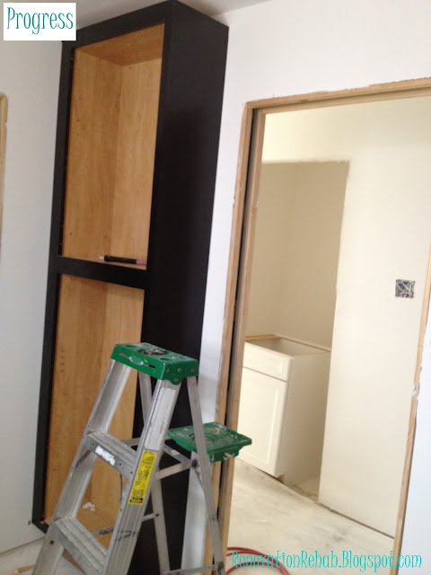
 And here is her twin on the opposite side of the door.  They still need their doors and crown molding, but this at least this lets you see how the cabinets will fit in the space.


I am telling you, these bad boys are going to send me to storage heaven! I absolutely cannot wait until I get to start filling them up the linens for the upstairs bedrooms and all sorts of fun bathroom goodies for our guests.  One things for sure, I will be spending lots of time over at I Heart Organizing to get plenty of ideas and inspiration on how I can organize this space and make it pretty! So here's to visions of loverly baskets and Martha Stewart Labels dancing in my head!!!  So how about y'all...do you have any good bathroom organization ideas or tips that you can share with me, because I need all the help I can get and would love to hear them!  Thanks you so much for stopping by and I hope that you have a wonderful week!!!


Thursday, May 9, 2013

Vintage Bathroom Remodel - Part 1

Hi guys! Well it's Thursday and I hope that you are ready for Mother's Day this Sunday! The weather has been amazingly beautiful here in Houston this past week and I am hoping that it stays that way throughout the weekend.  We are enjoying that last bit of cool before the sweltering summer heat that Houston is famous for hits.  So fingers crossed that it continues in honor of all the awesome mamas out there!  And speaking of enjoyment, we are also continuing to enjoy progress at the house.  Things are starting to move at a fast pace and our new move-in date is set for June 27th.  Considering our original move-in date was December 15th, I'm not holding my breath...but hopefully everything will continue smoothly and we will be back home in time for July 4th!  One of the areas of the house that has seen a lot of progress is the upstairs guest bathroom.  We have the cabinets installed and they are getting ready to start on the tile.  However, before jumping in on those pics, I wanted to first show you the state that this poor little room started when the demo began.  In one of my first posts, I told you that two of the driving motivators behind this renovation were the dangerous stairs and the tiny bathrooms.  Both bathrooms (we had one upstairs and one downstairs) were mirror images of each other and had a toilet, sink and tub.  However, they were only about five feet wide (I could seriously touch both walls when standing in the middle of the room) and were only functional for one person at a time.  In this floor plan, you can see the bathroom highlighted in yellow and can also see the general layout of the room. 
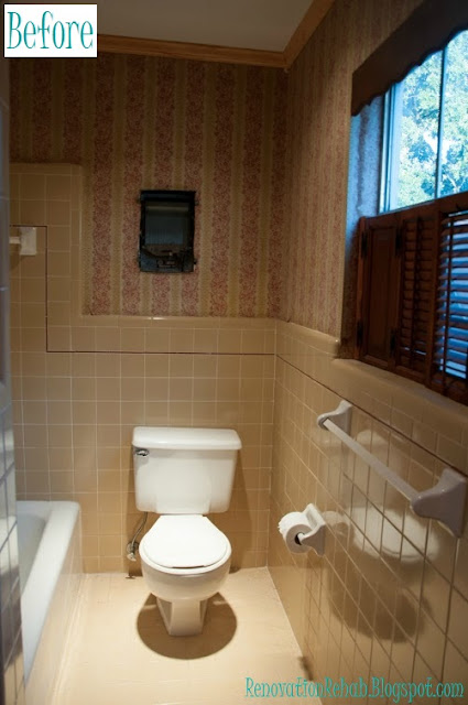
Not only did the layout of the room need help, but it's design was born in 1967 and apparently had a serious case of "failure to launch"...so all the finishes were in desperate need of updating!  Seriously, the bathroom had mustard yellow tiles with maroon accents, red and mustard yellow wallpaper, linoleum floors, and dark wood cabinets and wood shutters.  I am sure she was all the rage back in the 60's, but it was high time this little gal got a makeover and was brought into the 21st century.  So without further ado, here is what our little guest bathroom looked like when you first entered the door.
 

You had a small linen closet to your left and an angled sink on your right.  Then, once you turned the corner, you had the shower on your left and the toilet on your right. 


You can see in the pictures that we had added crown molding.  We did this when we first moved in when we thought that we would just freshen the room up a bit by removing the wallpaper and giving it a new coat of paint.  However, that wallpaper was applied with 1967 wallpaper glue, which will not be removed without a major fight.  So we never painted the crown and it went to the large dumpster in the sky along with the rest of the carnage once demo was complete. But I digress, so back to the tour. Here is the view of the sink from inside the shower.


And this is a view looking around the shower wall back towards the entrance of the guest bathroom.


And finally, here is a close-up of the wallpaper.  Like I said, it must have been FAB-U-LOUS back in 1967, but fast-forward 45 years...and it was TIRED and needed to go.


Just outside of the guest bathroom, there was an entrance into unfinished attic space.  This is where the A/C unit lived and where we stored our luggage and other items that were not heat/cold sensitive.  You can see the attic space highlighted in yellow along with the guest bathroom in the floor plan below.

And in this photo, you can see the entrance into the guest bathroom on your left and the entrance into the attic space straight ahead.


Here we have a view of the inside of the attic space.  This area is about five foot wide and, since it butts right up to the bathroom, I thought it gave us the perfect opportunity to expand the bathroom.


Since this is currently the only upstairs bathroom, I wanted to create two separate rooms in the space: (1) a room with the shower and toilet, and (2) a room with the vanities and linen closets.  By putting the shower and toilet in their own space, it allows for two people to get ready in the bathroom simultaneously - one in the shower while the other finishes up in the vanity room.  You can see the bathroom highlighted in yellow below and the general layout of the space.


So now that you had the tour, I thought I would leave you with some fun demo pictures...here we go!


Ba-bye vanity and miniature linen closet!


Adios mustard yellow tiles!


And may you rest in peace sweet wallpaper.  You had a good run...but it's time to dim the lights and say goodnight!

 
So that's all for now.  I will follow-up with the post-demo pics and the new cabinets soon! In the mean time, thanks for stopping by and have a wonderful Mother's Day weekend!!!


LinkWithin

Related Posts Plugin for WordPress, Blogger...