Showing posts with label Guest. Show all posts

Monday, July 22, 2013

Vintage Bathroom Remodel - Part 3


Happy Monday everyone! I hope that you had a wonderful and relaxing weekend. Things were busy here in Houston, but very productive at the house. As I mentioned last week, not only is painting in in full swing at the casa, but the tile in the upstairs guest bathroom is finally being installed and I am super excited to show you how it is turning out! Back in May, I introduced you to our oh-so-loverly guest bathroom and gave you the low down on my plans to give our tiny little "Ode-to-1960's-Wallpaper-and-Tile" guest bath a cool vintage makeover and bring her into the 21st century via the 1920's.  I also showed you the newly installed cabinets in my Vintage Bathroom Remodel - Part 2 post here. But, just to jog your memory, here is the layout of the original bathroom below highlighted in yellow:
 

As you can see, it was a small three piece bath with a single sink, a toilet and a five foot tub.  And here are some shots of the bathroom in all her 1960's wallpaper and tile glory:
 

The first picture shows the view into the bathroom from the hallway.  And this next picture is a view of the toilet and tub (with my back towards the vanity):
 

Although the bathroom had a fun 1960's vintage feel...it was the wrong era for my vision and just too small.  In order to allow two people to get ready in the bathroom at the same time, we decided to expand the bathroom so that we would have a vanity room and a separate shower room. The floor plan below shows the new bathroom highlighted in yellow (with a pocket door that can separate the shower room from the vanity room).
 

After resolving the space and layout issue, my next task was to create a mood board so that I could see how all the different design elements worked together. This is my original mood board that I created for our "vintage guest bathroom (circa 1920) with a hint of modern flare":
 
 
One of the major design elements that I wanted to incorporate into the vanity room was a "tile floor mat" using a combination of basket weave carrara marble tiles and 12"x12" carrara marble tiles.  The "tile floor mat" in this picture was my original inspiration for the space:
 
 
However, in order to work for our guest bathroom, I had to modify the design of the "tile floor mat" from a rectangle to a large "T" shape. This drawing shows the placement of the vanity and linen cabinets as well as the layout of the "tile floor mat" in the vanity section of the guest bathroom:
 
 
And here is how the floor looks installed:


I am so excited how it turned out and absolutely LOVE, LOVE, LOVE it!!! It is exactly what I envisioned and feels so crisp and clean! Here is another view where you can see how the floor works with the vanity, linen cabinet and wainscoting:
 
 
Happy days, happy days, happy days!!! The shower room section of the guest bathroom was too small for a similar floor mat; so we decided to carry the 12"x12" carrara marble tiles throughout that space. You can see the shower room highlighted in yellow below:
 

To keep with the vintage feel in the shower room, I chose white subway tiles for the shower surround.  However, with the white carrara marble floors and white subway tiles, I was afraid that the space might end-up looking a bit too institutional with all the square lines. So, to break things up, I added a herringbone feature to the back wall of the shower surround, which is illustrated in the drawing below:

 
I also made sure that the herringbone feature was centered on the pocket door between the vanity room and the shower room so that our guests would see it regardless of which part of the bathroom they were in.  This is what she looks like installed (and please note that the herringbone feature is centered on the door, I was just standing at the wrong angle when I took the picture):
 

Again, I am LOVE with how it turned out!!! The white subway tiles are so bright and cheery and the herringbone feature adds just enough interest and spice keep the space from being boring! Here is a close-up of the herringbone feature.  J'adore!!!
 

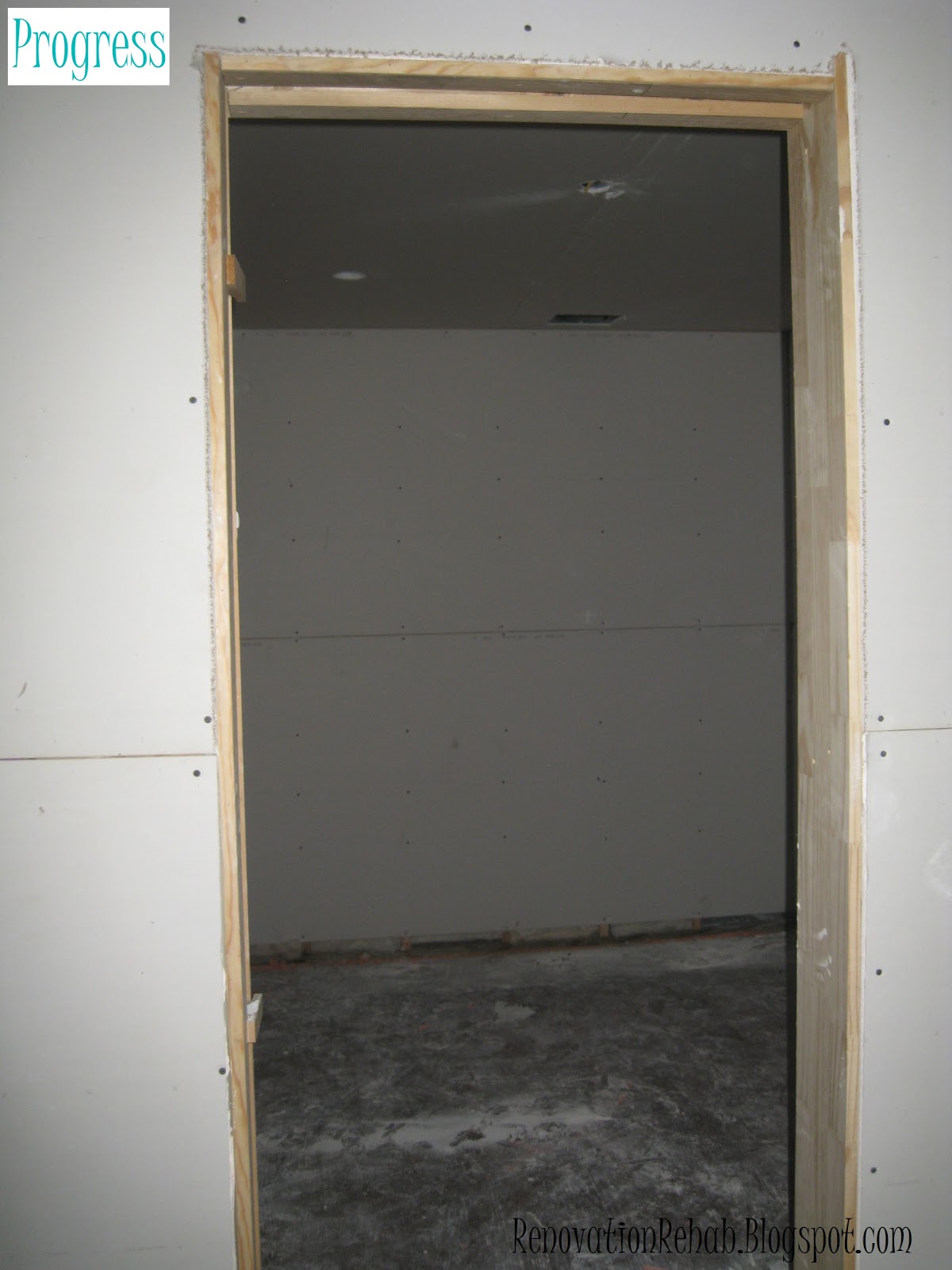
I am so giddy-like-a-school-girl with how everything is coming together!!! It totally makes all the heart-ache and stress of this year-long remodel fade into the background when I get to see my visions come to life!  Here's to hoping that I am going to be as in love with the rest of the remodel as things continue to progress!!! I hope that you are enjoying the progress and updates as much as I am. But before we go, let's have one more look at the the before and after (well, progress) pictures!


SO much better!!! Thank you so much for stopping by and have a wonderful week!
 
UPDATE: CLICK HERE TO SEE AN THE FINAL BATHROOM!


Wednesday, July 17, 2013

Let the Painting Commence!

Hello everyone! I hope that you are having a great week so far! We just returned from an amazing trip to London, Paris and Bordeaux for one of my dear friend's weddings. The wedding was absolutely BEAUTIFUL and it was so good to spend some time with our Aberdeen friends who we haven't seen for far too long! The renovations continued at the house while we were gone, with tile being installed and the long painting process commencing. So far, the painters have focused primarily on all the wainscoting and trim.  Last week, I showed you the primed and sanded wood work...but now, we have first coat of paint to the wood work as well (the walls and ceiling paint will come next).  It is really cool to see our color pallet finally coming to life!  In the words of Homer Simpson...can I get a "WooHoo"?!?!?! 
 
 
But before we check out the paint, here are the colors that we have picked for the house:
 
 
So now, onto the dining room and the living room. As you can see in the picture above, we are painting the wainscoting and trim a dark brown color called Bronzetone 60 from Benjamin Moore.  Here is a view of the dining room from the living room:
 

I love the rich color of the wainscoting. However, to keep the rooms from turning into black holes, are going to paint the walls a dark cream color by Ralph Lauren called Plaza Blanca.  The color is from their suede collection which will also give a subtle texture to the walls.  Here is another view of the dining room and the painted wainscoting. 


On the stairwell, we are using a custom cream color for the wainscoting. We chose to paint the stairwell cream because the color scheme upstairs is different than the color scheme downstairs...specifically, we are going to have bright white wainscoting and light gray walls upstairs.  So, in order not to have such a drastic change from downstair's cream walls and brown wainscoting to the upstair's gray walls and white wainscoting, we are using the stairwell as a transition area and will have cream wainscoting with the same Ralph Lauren Plaza Blanca color on the walls.  Here is a picture of the stairwell...although the color isn't showing quite right (it is more cream than white). 
 

Here is another picture of the stairwell where you can see the wainscoting a bit better.


And here is the upstairs hallway with all the wainscoting, baseboards and crown molding painted.
 

We are also painting the wainscoting in the reclaimed attic bright white. And in this picture, you can see the hidden doors that open up to major storage in the eaves of the attic.


And here is a picture of another upstairs bedroom. 

 
We previously painted the walls blue (I was going for a Wedgwood look) and are keeping the same color scheme.  However, we are repainting this room because we had to fix the chair rail and baseboard when we relocated the entrance door.   I LOVE the combo of the blue walls and white trim..it is very peaceful and relaxing to me.  So that is all for now.  I hope you enjoyed seeing the painting progress that we are making around the house. Thanks so much for stopping by! 
 

Thursday, February 7, 2013

Houston We Have Drywall (& a LaCantina Door)!


Hello everyone!  I hope that you have all been fantastic over the past few weeks.  Sorry about being awol for so long, but Matt and I were in Florence for a week for his work's annual meeting and then I have been going 150% at my job since getting back with a big project that has a tight deadline.  However, I had to share with you the exciting progress happening at the house.  The two biggest things are that we now have drywall and exterior doors! Holla!!!!  So let's take a tour of the casa to see how she looks with walls and doors shall we?
 
First I have to show you the super cool La Cantina door that we added that I first talked about here.  This door separates the living room from the back of the house and looks like a wall of french doors.


However, with the flick of a few locks and tiny bit of pushing....the doors completely fold-up to bring the outside in. Can I getta "TAH-DAD"?!?!?!


I am here to tell you that these bad boys are AWESOME!!! I love them because they literally double the size of the our living room when they are open. We are going to have some serious entertaining happening with these guys during the 8 months out of the year that we have good weather in Houston.  Here is a video of them in action. My commentary does not do justice my super cool happy dance that was happening behind the camera.


So now that you have seen the doors in action, I want to take you on a tour of the house with drywall.  Here is the floor plan of the downstairs, so that you can see the placement of the rooms.


Here is the view into the living room from the back patio.  The wine room is on the right under the stairs, the dining room is on the left of the door, and the entrance to the kitchen is in the left corner of the picture.


This is a view standing with my back to the wine room and looking towards the backyard.  Please excuse the disastrous landscaping (or complete lack there of) because all that will be addressed once we get finished with the remodel.
 

This picture is taken from the middle of the living room so that you can see the dining room.  It is crazy how much bigger everything looks in person once dry wall is up!  I guess it is difficult to judge the size of a room when you only have the studs.  You can also see our front door.  It is all wrapped up for safe keeping...but when the plastic is gone, it is beautiful.  As you can see, it is a similar style to a lot of the door I liked here. I love all the natural light that the windows and sidelights bring into the house.  And it will be even brighter once the protective film is removed from the windows.  Oh I can't wait!!!
 

This next picture shows our master bedroom.  It was a little difficult to photograph with my Canon Elf, but at least you can get a general idea of the room's shape.


Now onto the master bathroom (A.K.A. Jenn's happy place).  This is a view into the master bath from the master bedroom.  Here you can see the closet is in the back and the walk-in shower on the right. The tub will live to the right of the shower and our vanities will live on the left wall opposite of the shower.
 

This is a picture of the inside of the master closet.  You can't tell much from the photo, but it is 13' long by 10' wide.  I will show you my master plan for the master closet in a later post.


Here is another view of the back wall of the master bathroom. As you can see, the shower will be on the left side of the wall and the claw foot tub will be on the right under the window. We have his and her shower heads and body sprays, along with a rain shower overhead.  Matt gave me so much flack about having a "his-and-her" shower...but I think he will love it once it is all said and done.


Here is a close-up of the shower layout.  Oh boy, oh boy, oh boy!!!  This makes me giddy like a school girl!


This is a close-up of the wine room under the stairs.  We are going to have wine shelves in the recessed space on the right and on the back wall. I will show all the details in a later post.


Now we are going to head upstairs.  Here is the floor plan for the second floor so that you can get your bearings.
 

The first thing you see when you head up the stairs is the study.  We will have built-in cabinets and a desk along the back wall.


Next we head into the revised game room.  It's amazing how far it has come since we blew out the front wall.  This is a view from the back corner of the room looking towards the study, which you can see through the door.


Here is another view of the game room from the front side of the house.  We are going to add a built-in bar in the nook on the left.  And through the door, you can see the entrance to the laundry room.  I showed you some of my ideas for the laundry room here.


This is a view of the hallway leading to the back of the house.  To my left is the study and to my right are the stairs, game room and laundry room.  As you walk down the hall, the first door on the left is the entrance to the guest bathroom, the first door on the right is my wrapping room (which is not labeled in this picture), the second door on the right is Bedroom 3 (A.K.A. the "Blue Room"), and the final door in the middle is the entrance to the new bedroom above our master (Bedroom 4).


Here is a picture of Bedroom 4. It is directly above our master bedroom, so is basically identical.
 
 
When you turn around and leave Bedroom 4, you are back in the hall heading towards the study and Bedroom 2 (A.K.A. the "Teepee Room"). As you head down the hall, the first door to my left is the entrance to the Blue Room (which you can't see in this photo) and the second door to the left is my wrapping closet.  I talked about my initial plans for the layout of the wrapping closet here and here.  The first door on the right is the guest bathroom, followed by the study and the Teepee Room.
 
 
Here is a pitiful little picture of part of the guest bathroom. We will have two vanities on either side of the window and to the right are the shower and toilette. I need to invest in a super wide lens so that I can get better pictures for everyone!
 
 
After you exit the guest bathroom and enter the study facing the Teepee Room, this is the view you will see.  To my left are the stairs and to my right is the study.  Directly in front of me is the entrance to the Teepee Room.  Two closets flank the entry into the Teepee Room.


Here is what the Teepee Room loooks like on the inside.  It is a long (23') and narrow (11') room with an arched roof.  This will likely become our kiddo's game room with all sorts of fun murals.  It just feels like a place you want to play when you go in.  I also added built-in storage into the eaves...cause hey, if there is a possible open space, I will use it!  Our builder makes so much fun of me for that - but trust me, we will love all the additional storage at some point down the road, I just know it!  We will have doors on the front of the opening that will look like wainscoting so they won't be so obtrusive. 


So that finishes up the tour of the casa with dry wall.  Also, thank you so much for stopping by, I hope that you liked seeing the progress!  Have a wonderful day!!!
post signature

Monday, December 10, 2012

Taking It Back To The Old School…

A couple of weeks ago, I showed y'all the vintage design that Matt and I are trying to emulate in our guest bathroom (here).

We have run into a bit of a road block, however, because we love the black-and-white color scheme you see in a lot of vintage baths, but are concerned that it will be too harsh in our small space. So after scouring Pinterest, Houzz and Decorpad, I found an alternative option that I love, but am afraid that it strays too far from "vintage" theme to a more glamorous feel. The first pic below is our original inspiration and the second pic is my alternative.


I don't know about y'all, but when I hit a road block in trying to design a space, I like to go to the stores to see all my options in person. It is so much easier for me to make decisions once I have a chance hold the hot little gadgets in my hands and see what they look like "for real" (yo). So I hit Ferguson's, Morrison's, the Depot and Lowes and found all kinds of great inspiration. First, I found two contenders for our faucets.


I love the goose neck design on both faucets and the cross handles. Both faucets are extremely similar, but I am leaning more towards the first faucet because I like the thickness of the handle bases. But I love the "Hot" and "Cold" labels on the second faucet's handles, which scream retro to me.


After finding two faucet options, I checked out the shower systems. The first guy that caught my eye was this beauty:


I absolutely adore the exposed pipes, the mix of the cross-handle and lever, the extended gooseneck and the large showerhead. I also love the oil rubbed bronze color; however, we will use polished chrome in the guest bath. The only problems with this shower system are the fact that it did not come with a matching tub faucet (although I am sure the company has coordinating pieces in the collection) and that it was a budget breaker. So, I kept searching and the next possible contender I found is this little gem:


It has a similar goose-neck and large showerhead, but does not have the exposed pipe (which helps with my budget concerns). I also love the tub faucet and the "Hot" and "Cold" labels on the shower valve. So after about 5 hours of retail therapy, I felt like I had a better handle on our "vintage" vision. But before I left the last store, I had to snap this guy:


Cause how freaking cool would it be to have a dragon in our bathroom! I figure that if I can't get this room sorted, we will ditch the "vintage" theme and design the bath around this bad boy. Options people, you always have to have options. Once I got home, and was armed with my original design photos and my new shopping inspiration, I hit Olioboard to create my "Vintage Bathroom" inspiration board. I ended up blending the two bathrooms together and think that this board is a good mix of vintage and glam.

Vintage Guest Bathroom Olioboard

The plan (for the moment) is to keep the black and white basketweave floor tiles and subway tile wainscoting, but soften the room with light gray walls, blue accents and white trim. We will also pick-up the vintage feel with the sink and shower faucets and the memoirs toilet. I am pretty happy with how the blended look is shaping up (meastro, que happy dance music please). But I would love to hear what you think, so please feel free to post a comment! Thanks for stopping by and have a wonderful day!

post signature

LinkWithin

Related Posts Plugin for WordPress, Blogger...