Happy hump day everyone! I hope that you are having a fantastic day so far. Things are fab here! I survived the "Great Disaster Room Cleanout of 2014" and will show you the updates this week. It is amazing what 14 hours of hard labor can do for a massive mess! So that is one step closer to being really moved into the house...and I am so excited! I wanted to stop by today to show you where we are with the guest bathroom. Last time we checked-in, I showed you the floors, wainscoting and subway tile shower surround. So today, I wanted to show you the latest version since all of the "hardscape" is in and we are now just left with accessorizing. Happy days!!! As a reminder, here is the upstairs floor plan before we started the renovation and the guest bathroom is highlighted in yellow:
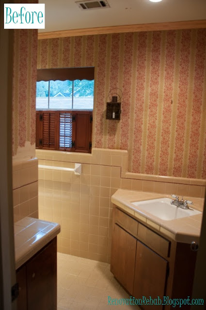
As I have previously mentioned, one of the main reasons for our renovation was to update and enlarge our tiny bathrooms. Although the bathrooms had a fun vintage look, it was not the look we were going for. Here is what the vanity area looked like before the renovation:
And here is what the shower/toilet area looked like:
So as you can see, super dark and super tiny!!! In order to make it so that two people could get ready at the same time, we decided to make a separate vanity area and a separate shower/toilette area. Here is the floor plan for the remodeled second floor and the new bathroom is highlighted in yellow:
As I previously mentioned, we were going for a 1920's vintage feel with carrara marble, white subway tiles, and dark cabinets. This is the original mood board that I made for the bathroom:
And here is how she turned out! This is a view looking into the vanity area from the shower/toilet room:
We have a double vanity on the right side of the room. And on the left side, we have two floor to ceiling linen cabinets. This is a fairly tight space, but between the vanity and the two linen cabinets, we have a TON of storage!!! We also added the white wainscoting to give the room a tailored look and chose a cool grey to play off of the carrara marble counter tops. One of my favorite features of the bathroom though is the basket weave tile "floor mat" that we added in the vanity area:
I absolutely LOVE the way that it turned out!!! To me, the floor gives a super retro vibe and is a fun surprise. And please excuse the quality of the following picture, but here is what the bathroom looks like when you enter from the hallway.
You can't tell from that picture (because I was using my IPone), but there is about an 8" space between each side of the vanity and the wall...so the vanity actually looks like a piece of furniture as opposed to a built-in cabinet. Now moving onto the shower/toilet room. In the shower I chose white subway tile for the shower surround, a large goose neck shower head (because there are many 6'4"+ men in my family that will visit), and a hand shower that I can use to more easily bath children (once they join the picture):
In the middle of the shower, to break up some of monotony of the subway tiles, I added a framed herringbone feature.
I am so excited with the way it turned out! I think it is super elegant with a splash of fun. And on the back side of the shower we added a train rack to hang robes and store towels for our guests:
The train rack is so pretty!!! It makes me not want to hang a shower curtain so that I can see it all the time. And as you can see from the picture above, I also added a little bench at the end of the tub. I thought this would be a great place to sit when bathing kiddos and also will be a nice place for them to store their bath toys. So there you have it folks! I still have a ton to do with all the accessorizing, but have made huge progress! And speaking of progress, lets check out a couple before and afters shall we?!?!?!
And one more of the shower area! So much better!!!!
Thanks for stopping by and have a wonderful day!!!
.jpg)


.jpg)
.jpg)
.jpg)
.jpg)
.jpg)
.jpg)
.jpg)
.jpg)

No comments:
Post a Comment