Thursday, February 6, 2014

What Would Ralph Lauren Do?

Hi everyone! We just got back from Italy for Matt's company meeting. Yeap, you read that right, company meeting. Seriously, it is one of the coolest perks of his job! His company's headquarters are in Florence where they have their annual sales/customer meeting, and I get to tag along. Woohoo! We usually try to go several days before or stay after the meeting to explore and have time to ourselves, and this year we did a tour to our favorites: Venice, Siena, and (of course) Florence. Although it flooded in Venice on our last day and was a bit rainy in Siena and Florence, we had an AMAZING time and it was so nice to spend an entire week with just the hubs. One of my favorite pastimes when we are in Florence is to simply stroll the streets and soak in all of the latest fashion trends in the motherland of style. I mean, when a country is the birth place of such fashion icons as Gucci, Prada, Valentino, Missoni, Brioni, Versace, and my personal favorite, Salvatore Ferragamo (swoon), even the children are mini fashionistas and play in the streets all decked out in their uber posh labels! Seriously, Gucci has a massive section in their flagship store dedicated solely to the bambinos:


In addition to the clothes, I also love classic Italian interior design and enjoy exploring the palaces to drool over the beautiful frescoes, chandeliers, furnishings and finishes:


And you can also find some amazing design elements in many of the hotels, like this fabulous rug and the beautiful Murano glass chandelier:

2671_reception2

Or the mix of the classic moldings, regal linens, Murano sconces, and modern mirrored chest:

2674_camere3

When selecting the finishes for our house, I tried to incorporate some of the design elements that we have found overseas during our travels. Like the dark wood trim and light walls in the Grand Hotel Baglioni's hallways (oh, and who can miss that AMAZING ceiling...hello lover!): 


Does that paint and trim color scheme look familiar?
 

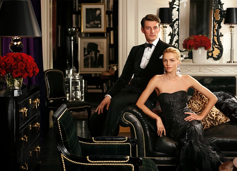
But as much as I love Italian decor, it is just a ttteeeeennnnssssyyy bit too glitzy for our house and not nearly approachable or cozy enough for everyday life. Instead, for our home, I want the furnishings and decoration to give me and my guests a feeling of warmth and welcome (like being wrapped in a hug when coming into the house)...and I find myself constantly drawn to English-inspired design, with its beautiful wooden antiques, bright rugs, and tartan fabrics. Don't get me wrong, I still love glamor and drama, and absolutely plan to incorporate that into the house to keep things fresh and for some added flare. And to me, when it comes to taking classic furnishings and infusing them with a modern twist and a pop of glamour...no one does it better than my personal design Mr. Miyagi - Ralph Lauren. And his Apartment No. One collection is spot on with my vision:

 
In this collection, Ralph, or Mr. Lauren if you're nasty (NASTY! Nasty boys, don't mean a thing! Bomp bomp bomp da la bomp bomp, Oh you nasty boys! Gotta love some Janet!), has masterfully mixed classic elements likes the black chesterfield couch, the red and navy oriental rug, the tartan chairs, fabulous moldings and crystal chandelier, with modern pieces like the black lacquered chest, the sleek wood coffee table and the cheetah print throw pillow. Perfection! And here are a few more pictures from the Apartment No. One collection:
 
http://www.ralphlaurenhome.com/collection/2013_Fall/AptNoOne/default.aspx?collId=202

The mix of the black furnishings, gold trim, white walls and red roses in this picture are is so glamorous! To me, this room looks like it was pulled out of a 5th Avenue apartment in NYC.
J'ADORE!


And how cute are those dogs!  I also love the mix of tartans, croc, and leather in the dining room below:


Oh those pictures just make me happy! And the best thing about Ralph Lauren and the Apartment No. One collection, is that Matt loves it too!!! We actually 100% agree on this (shocking, I know)! So now that we have been back in the house for a few months and have a better feel of how the new layout will work, we are starting to look for new furniture to take over for our parents' hand-me-downs, and our motto for the project has been WWRLD (i.e., "What Would Ralph Lauren Do?"). Here are some of my favorite pieces from the Apartment No. One collection. The chesterfield couch (i.e., the Brook Street Tufted Couch):


the New Bohemian Cocktail Table:

http://www.ralphlaurenhome.com/products/furniture/item.aspx?haid=62&collId=&shaid=&sort=&itemId=10373&phaid=

the Brook Street Chest:
 

the Cannes Gueridon Table:


and the Bishopgate Mirror:


And for any Downton Abby junkies like me...this mirror is featured in the dining room this season (since Ralph Lauren is one of the sponsors). I don't have a screenshot now, but will post it tonight! However, no matter how gorgeous they are, the simple fact that they are Ralph Lauren makes them SUPER EXPENSIVE (like, you could buy a car for the price of any one of these little beauties...OUCH!!!). So needless to say, although I adore all of these pieces, they won't be making their way into our casa anytime soon. Instead, I am using them as my inspiration and have now commenced the "Great Furniture Hunt of 2014" to try and find some equally fabulous but substantially more affordable finds. It's going to be tough, but wish me luck! I will keep you posted as I go. So ladies and gentlemen, start your engines and let the shopping commence!!!


Wednesday, January 22, 2014

The Great Disaster Room Cleanout of 2014

Hi everyone! I hope that you are having a wonderful week so far! So last week I gave you guys a teaser about the "Great Disaster Room Cleanout of 2014". The battle was fought in the new bedroom that we added above our master, which, thanks to its navy walls, we have lovingly dubbed the "Navy Room". Yeap, don't let anyone ever tell you that we aren't a creative bunch over here Renovation Rehab! As I previously mentioned, over the past four months, this room has become the dumping ground for anything and everything that we wanted to keep, but that didn't have a forever home in the house. It also housed a bunch of junk stuff that we have zero intention of keeping...but haven't decided what we want to do with (i.e., donate, put on Craigslist, or if we want to have a garage sale). And what started out as a few piles on move-in day, turned into an absolute disaster! I give you Exhibit A:
 

Exhibit B:
 

And Exhibit C:


Can you believe that! It is shameful. The room was so full of stuff, that we couldn't even walk into it. Nearly every square inch was filled with boxes, bags, furniture and junk. But please don't call Hoarders just yet, because after FOURTEEN hours of hard labor, I my friends, emerged victorious!!!
 

I may or may not have hollered "For the honor of Greyskull, I AM SHE-RA!!!!" after the all was said and done! Here is the left side of the room around midnight after 14 hours of cleaning:
 

And the right side of the room:
 

Although it is not completely devoid of boxes and has a "To-Do" list a mile long, it is ONE MILLION times better than it was when I started! Here is a panoramic view of the room so that you can get a better idea of the layout:


It is nice to know that guests can at least sleep in it if need be; however I still have a ton to do in the room:
Navy Room "To-Do" List
Finish removing all boxes
Find a rug
New duvet cover, sheets, shams and throw pillows
Paint lamps and find new shades
Install shutters and window treatments
Get new bedside tables and dresser so everything is not matchy-matchy (but paint or refinish in the meantime)
Find artwork for above the bed and other chotchkies for the left wall
Find a mirror or make a photo wall above the dresser
Add a cozy reading chair
Add fun accessories throughout the room
Touch-up the paint
 
And as far as inspiration goes, we are leaning towards an English library/equestrian theme for this room with a feel like this:
 
This just may be my favorite "library" pin ever.  The colors are warm and earthy, love the wall color and equestrian art.  Everything literally glows.  Perfect.
 
I love how inviting, warm and cozy the room feels.  I also love the layers of texture and colors that they have throughout. Here are a couple other equestrian vignettes that I have also been crushing on:
 

Robin King Designs: English Country Equestrian Style


As far as the dresser and end tables are concerned, I am envisioning a mixture of woods, leather, and metals. I absolutely LOVE the design and the variation of the dark and light woods on this dresser:

Products Design Ideas, Pictures, Remodel and Decor

And here is another dresser that I am smitten with:

Love the tartan design {highland tartan chest}

The two-tone wood adds interest and, after living in Scotland, I am pretty much sold on anything I find that has a tartan pattern. Le' sigh!!! For the bedside tables, I want to find pieces beyond your typical wooden nightstand. Like these stacked vintage suitcases:

Love the bedding and the LV suitcases as a side table. Awesome!

Or possibly a retro trunk:

Authentic Models Stateroom End Table | Wayfair

I am also digging this cute game table.
 
Authentic Models End Table 

As far as the equestrian theme is concerned, I plan to bring that in through accessories...so there is an equestrian theme, but not like you feel like you just walked into a barn. I am thinking subtle and classy touches of equestrian, like this fabulous lamp:
 

And introducing horse bits through pillows:
 
Equestrian pillow

and picture frames:
 
Each Equestrian frame is meticulously handcrafted and detailed with beveled glass, satin liner, leather back, and decorative closure.

and drawer pulls:
 
Snaffle Bit Pull Brass Pulls and Knobs - Hardware - By Mayer Mill Brass #BTDP-1 at Horse and Hound Gallery 

I also found these super fun umbrella stands that I am digging:
 
Equestrian-style décor is timeless and seasonless, and the decorating possibilities are endless.
 
I would also like to work in the Union Jack somehow. For the most part, I think I would like this to be subtle...but then again, I could scrap the whole plan and go completely over-the-top with this fabulous dresser:


It is so much fun! So we shall see how the room evolves. I am going to work on my mood board tonight and will fill you guys in as progress is made. Thanks so much for stopping by and have a wonderful week!


Wednesday, January 15, 2014

Vintage Bathroom Makeover {Part 4}


Happy hump day everyone! I hope that you are having a fantastic day so far. Things are fab here! I survived the "Great Disaster Room Cleanout of 2014" and will show you the updates this week. It is amazing what 14 hours of hard labor can do for a massive mess! So that is one step closer to being really moved into the house...and I am so excited! I wanted to stop by today to show you where we are with the guest bathroom. Last time we checked-in, I showed you the floors, wainscoting and subway tile shower surround. So today, I wanted to show you the latest version since all of the "hardscape" is in and we are now just left with accessorizing. Happy days!!! As a reminder, here is the upstairs floor plan before we started the renovation and the guest bathroom is highlighted in yellow: 
 
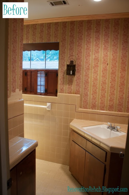
As I have previously mentioned, one of the main reasons for our renovation was to update and enlarge our tiny bathrooms. Although the bathrooms had a fun vintage look, it was not the look we were going for. Here is what the vanity area looked like before the renovation:
 
 
And here is what the shower/toilet area looked like:
 
 
So as you can see, super dark and super tiny!!! In order to make it so that two people could get ready at the same time, we decided to make a separate vanity area and a separate shower/toilette area. Here is the floor plan for the remodeled second floor and the new bathroom is highlighted in yellow:
 
As I previously mentioned, we were going for a 1920's vintage feel with carrara marble, white subway tiles, and dark cabinets. This is the original mood board that I made for the bathroom:
 
 
And here is how she turned out! This is a view looking into the vanity area from the shower/toilet room:
 
 
We have a double vanity on the right side of the room. And on the left side, we have two floor to ceiling linen cabinets. This is a fairly tight space, but between the vanity and the two linen cabinets, we have a TON of storage!!! We also added the white wainscoting to give the room a tailored look and chose a cool grey to play off of the carrara marble counter tops.  One of my favorite features of the bathroom though is the basket weave tile "floor mat" that we added in the vanity area:


I absolutely LOVE the way that it turned out!!! To me, the floor gives a super retro vibe and is a fun surprise. And please excuse the quality of the following picture, but here is what the bathroom looks like when you enter from the hallway.


You can't tell from that picture (because I was using my IPone), but there is about an 8" space between each side of the vanity and the wall...so the vanity actually looks like a piece of furniture as opposed to a built-in cabinet. Now moving onto the shower/toilet room.  In the shower I chose white subway tile for the shower surround, a large goose neck shower head (because there are many 6'4"+ men in my family that will visit), and a hand shower that I can use to more easily bath children (once they join the picture):


In the middle of the shower, to break up some of monotony of the subway tiles, I added a framed herringbone feature. 


 I am so excited with the way it turned out! I think it is super elegant with a splash of fun. And on the back side of the shower we added a train rack to hang robes and store towels for our guests:
 
 
The train rack is so pretty!!! It makes me not want to hang a shower curtain so that I can see it all the time.  And as you can see from the picture above, I also added a little bench at the end of the tub. I thought this would be a great place to sit when bathing kiddos and also will be a nice place for them to store their bath toys. So there you have it folks! I still have a ton to do with all the accessorizing, but have made huge progress! And speaking of progress, lets check out a couple before and afters shall we?!?!?!


And one more of the shower area! So much better!!!!


 Thanks for stopping by and have a wonderful day!!!
 

LinkWithin

Related Posts Plugin for WordPress, Blogger...